
Visualize your project work and cost in S-Curve and bar charts with various options to customize the values, chart type, chart units and X-axis scaling.
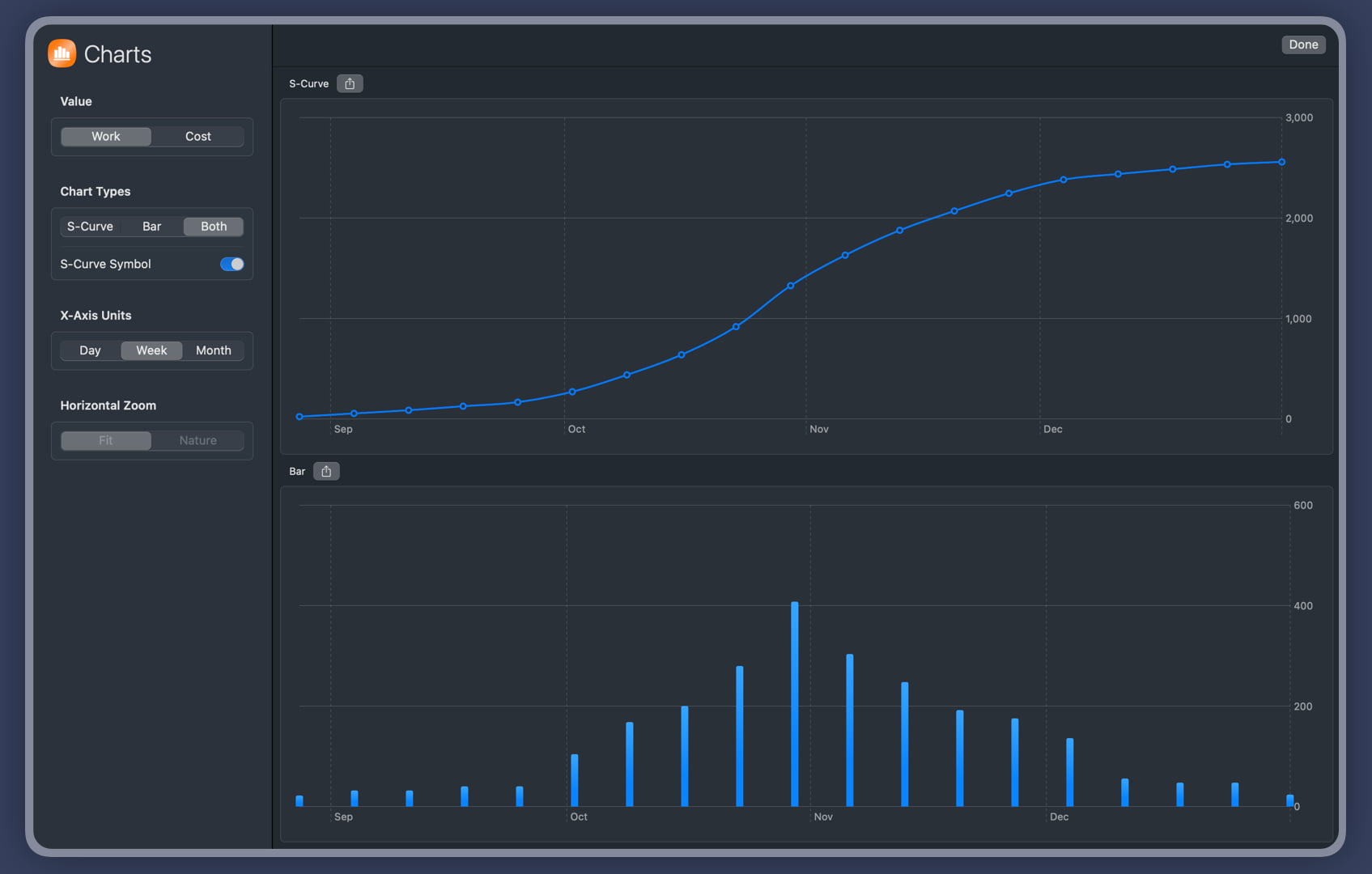
You can choose to toggle the current workload or cost values, display S-Curve charts or bar charts, display charts in days or in weeks or months, etc. This will help you to visualize the progress and performance of your project in a more intuitive way. You can also export your charts to png image files and share them with your team members, clients or stakeholders. This will make it easier for you to communicate your project status and results with others.
- Display either S-Curve charts or bar charts, or you can display both charts together.
- Toggle the display of project work or project cost data。
- Show or hide S-curve symbols
- Display the date unit in days, weeks, or months.
- If there are a lot of points to display, you can select the horizontal size of the chart to be its natural width and support horizontal scrolling.
- Save the chart as a PNG image file. You can choose to save the chart as a PNG image file to share with your team or use in reports.
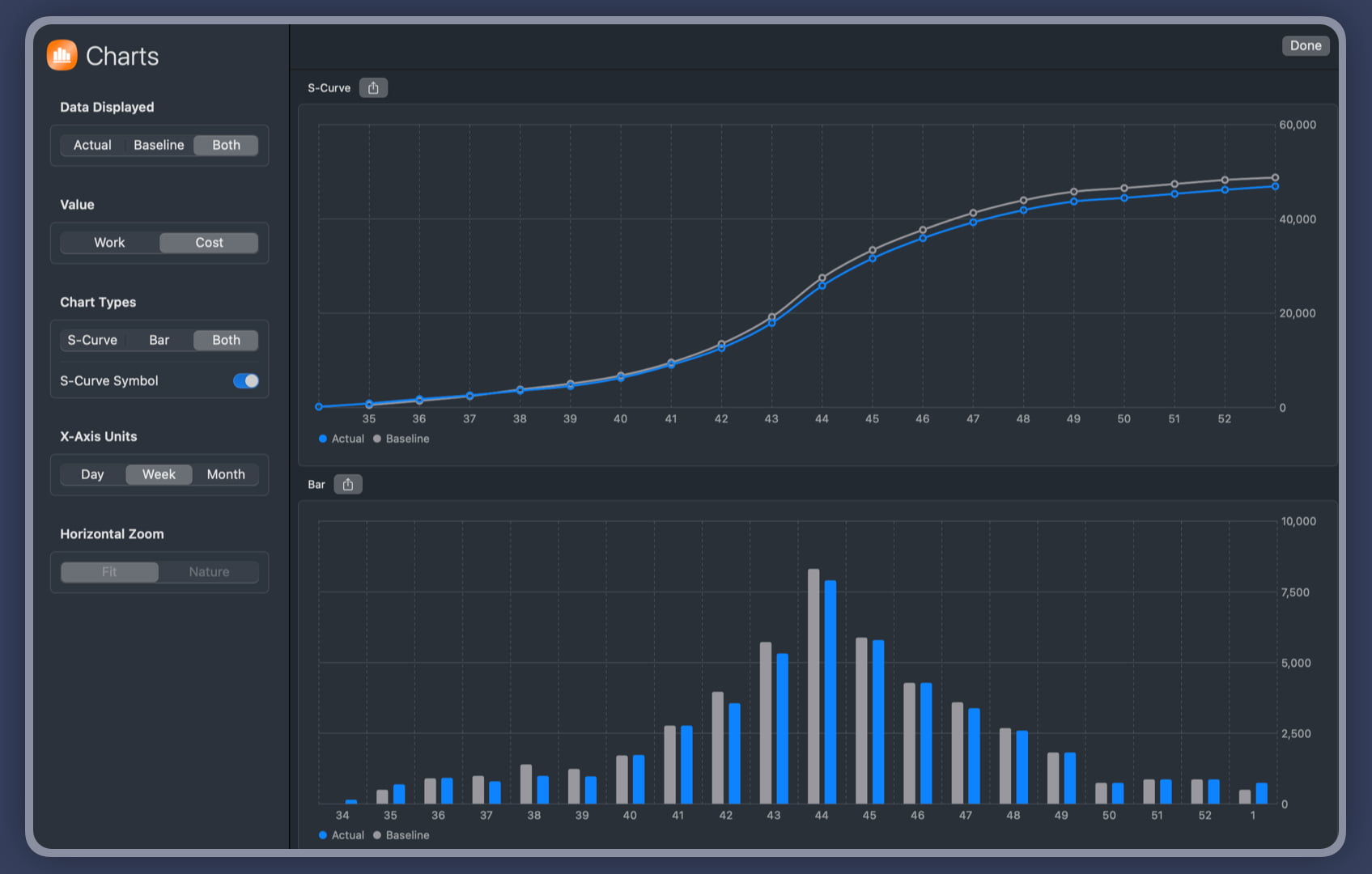
Compare to Baseline
QuickPlan allows you to archive the date, duration, work, and costs fields of your project and use them as the baseline data.
If the work or costs in the archived fields differ from the actual fields, QuickPlan charts can show the baseline and actual data together.
Project Operations
Project Properties
Task Maintenance
- Task Structure
- Task Fields
- Create Task
- Insert Task
- Remove Task
- Indent and Outdent
- Copy / Paste Task
- Repeat Task
- Split Task
- Maintain Properties on Gantt
- Maintain Properties on Outline
- Property Updating Panel
- Task Link Maintenance
- Task URL Maintenance
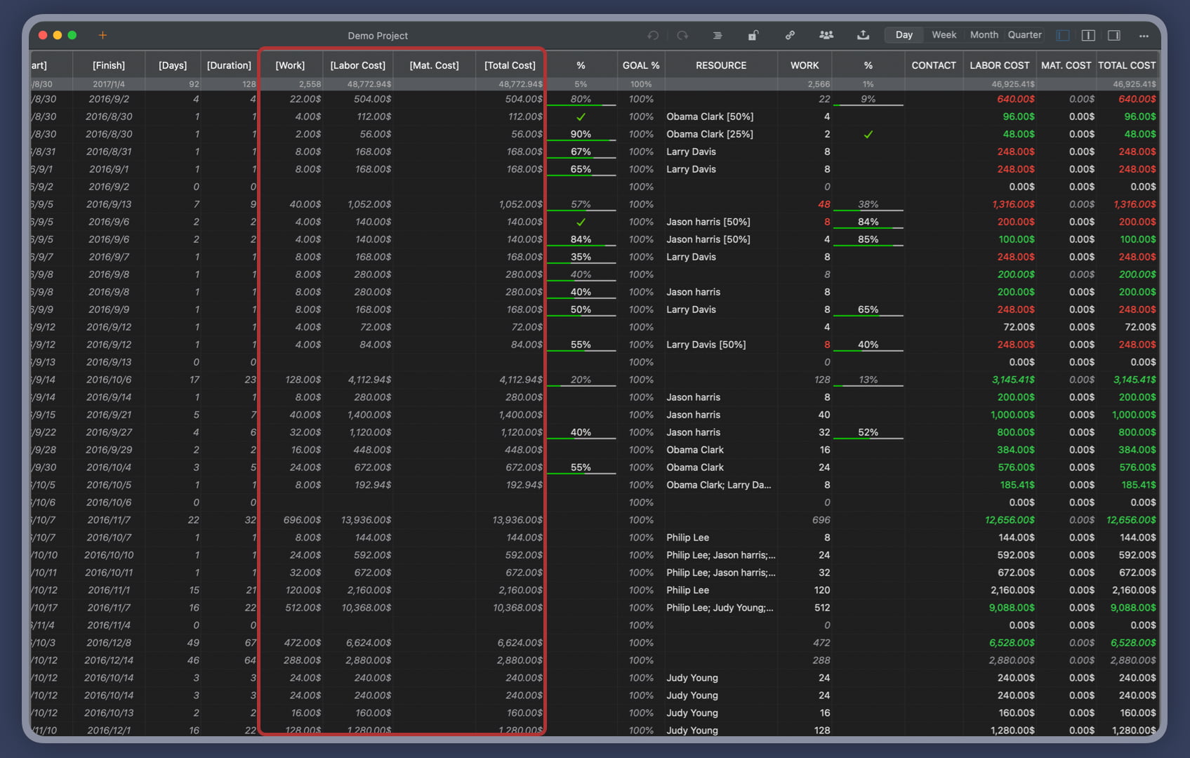
- Date, Work and Costs Baseline
- Critical Path
- Seach & Replace
Efficent Maintenance
Task Display
Customizations
Alarm
Synchronization
Team Collaboration
Partical Exporting